Tips for Living with Buffalo Check

Ever since Gloria Vanderbilt papered her living room in pink gingham in the 1970's, I've loved this familiar pattern. It is so many things: fun but a tad boring, colorful but even, and classic but modern. Just about everyone I believe has lived with gingham in some way. My childhood room was done up in a yellow and white version. This familiar pattern represents American style, simpler times, and comfort. From picnic cloths to summer dresses, living with gingham is a classic choice and always feels right.
As a designer, I am always thinking of ways to update the classics, so things feel a little edgy and current. So when it comes to ways to live with and make gingham seem a little more modern, here are some ideas.
1. Use a Smaller or Larger Scale
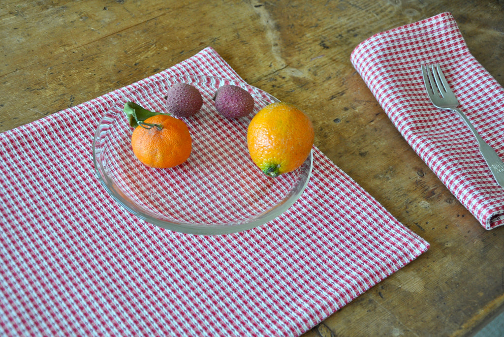
Changing the scale of a pattern can make a huge difference is how it we see it in a room. Making a pattern larger or much smaller than what's typical immediately adds interest, energy, and a freshness to it. So that is what we have done with our Hancock table linens (image below). Hancock is a gingham, but tiny - and it feels fresh. In the second image, this wallpaper looks so contemporary due to its scale. The second photo is from House & Garden. When you play with scale in new ways, there is an automatic sense of modernity and chic in a room.


2. Keep Things Simple (colorwise)
The other trick for keeping things unified is to embrace monochromatic or analogous colors in the design. This is true especially with a pattern like gingham, which at a larger scale, can become very vibrant and hard to control. In interiors or with home goods, keep patterns unified through color. This will tend to calm down the space and make it seem coordinated. The image below illustrates this perfectly. It is a hotel room at Hotel Peter Paul in New Orleans and decorated by Ashe NYC. Here, all this gingham goes beautifully together, thanks to the tighter color palette.

3. Use the Pattern Sparingly
When a pattern seems noisy, only use a little. Instead of upholstering your whole sofa in it, you could do a series of pillows instead. Or, rather than having an entire table cloth in a loud pattern, you could have patterned placemats or napkins, and keep the table cloth solid. Sometimes, a little goes a long way. I love this image from Jane Churchhill fabrics, where she uses just two tiny gingham pillows in this room. It's just the right amount.

4. Use Checks to Add Visual or Tactile Texture
The last idea is to add some tactile and visual texture to the weave. Modernists often use textures for interest. There is a perfect opportunity with gingham to add some texture. The detail of our new Hancock fabric shows how a little surface texture goes along way in creating another layer of interest.

We have used all these ideas in our new Hancock Table Collection, which is a small mini check pattern that comes in three colors: raspberry, celery, and toast. The fabric is cotton dobby, so it is a nice medium weight weave with a beautiful texture. When looking from afar, this fabric has the simplicity of a solid, but up close, it has all the interest of a classic repeating gingham. This fabric is reclaimed, so we saved it from the land fill. We have it in placemats, napkins, and coasters. Every time I see this fabric, it feels current and yet still connects to the long history of using gingham in interiors, in home goods, and fashion. As a table collection, this little pattern checks all the boxes: it can go casual to formal, its machine washable, and it can blend into any decor or table scape without being boring. Long live buffalo checks.
For further reading, this is a great article from House & Garden UK about innovative ways to live with gingham.


